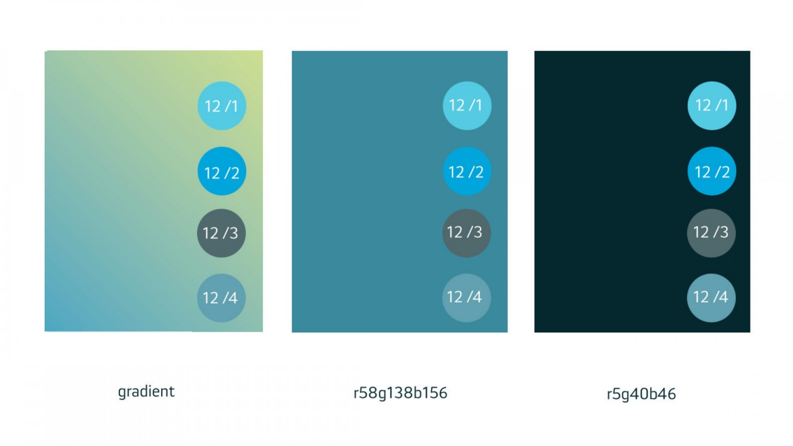
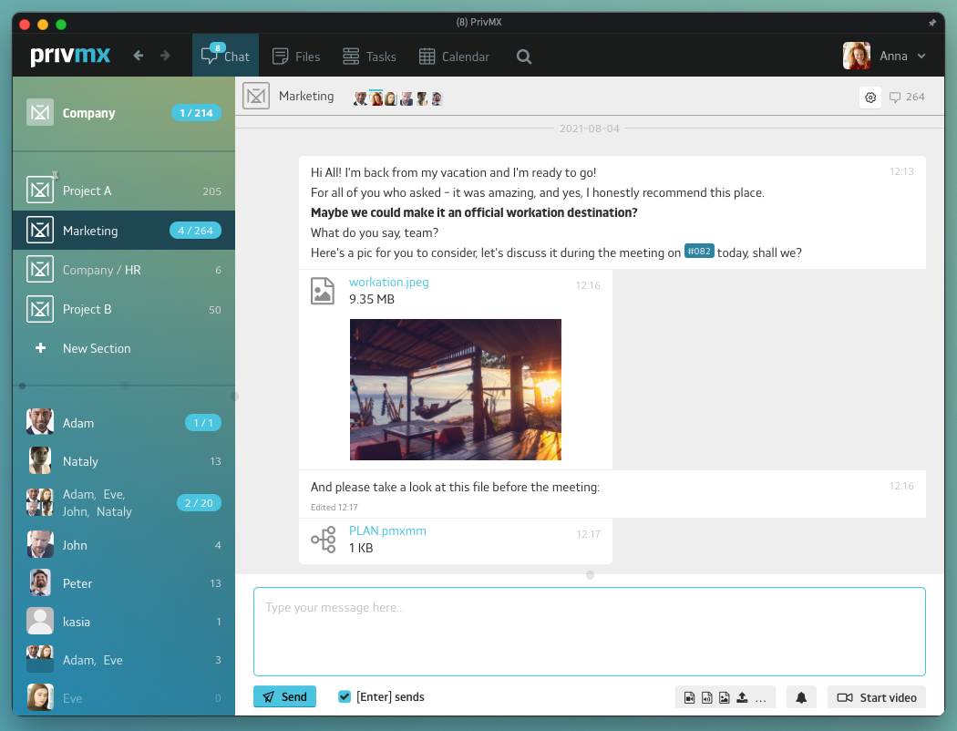
We’re introducing a few more colors to the interface settings - the new version (available soon!) of PrivMX app allows you to customize your color palette and choose between a few background and bubbles’ options. We need your help to choose the default version.

So far, PrivMX background was a characteristic gradient, but we want to try something new. See the new options for color combinations:
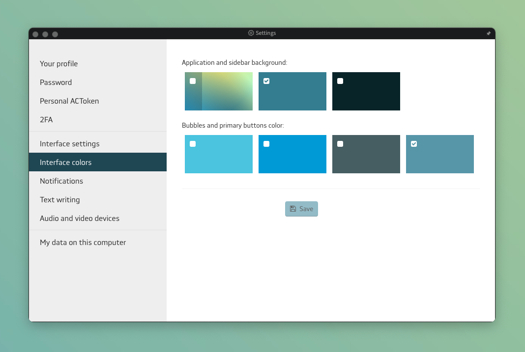
Hope you'll enjoy setting up your own palette!
Now we need to decide on the default interface settings for new users. We'd really appreciate your feedback on which combination works better.
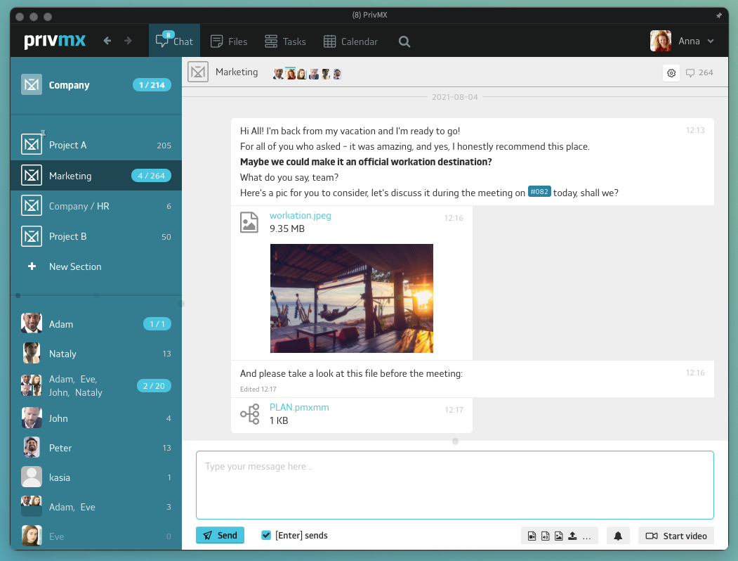
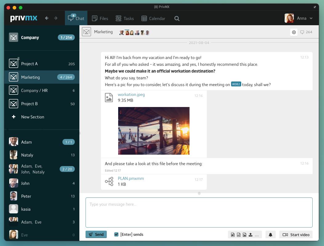
Let us know - we're waiting for your feedback at contact@privmx.com We've prepared simple inquiries on our social media channels - feel free to offer your insight there:
Thanks for your help!
 Kasia Toczko